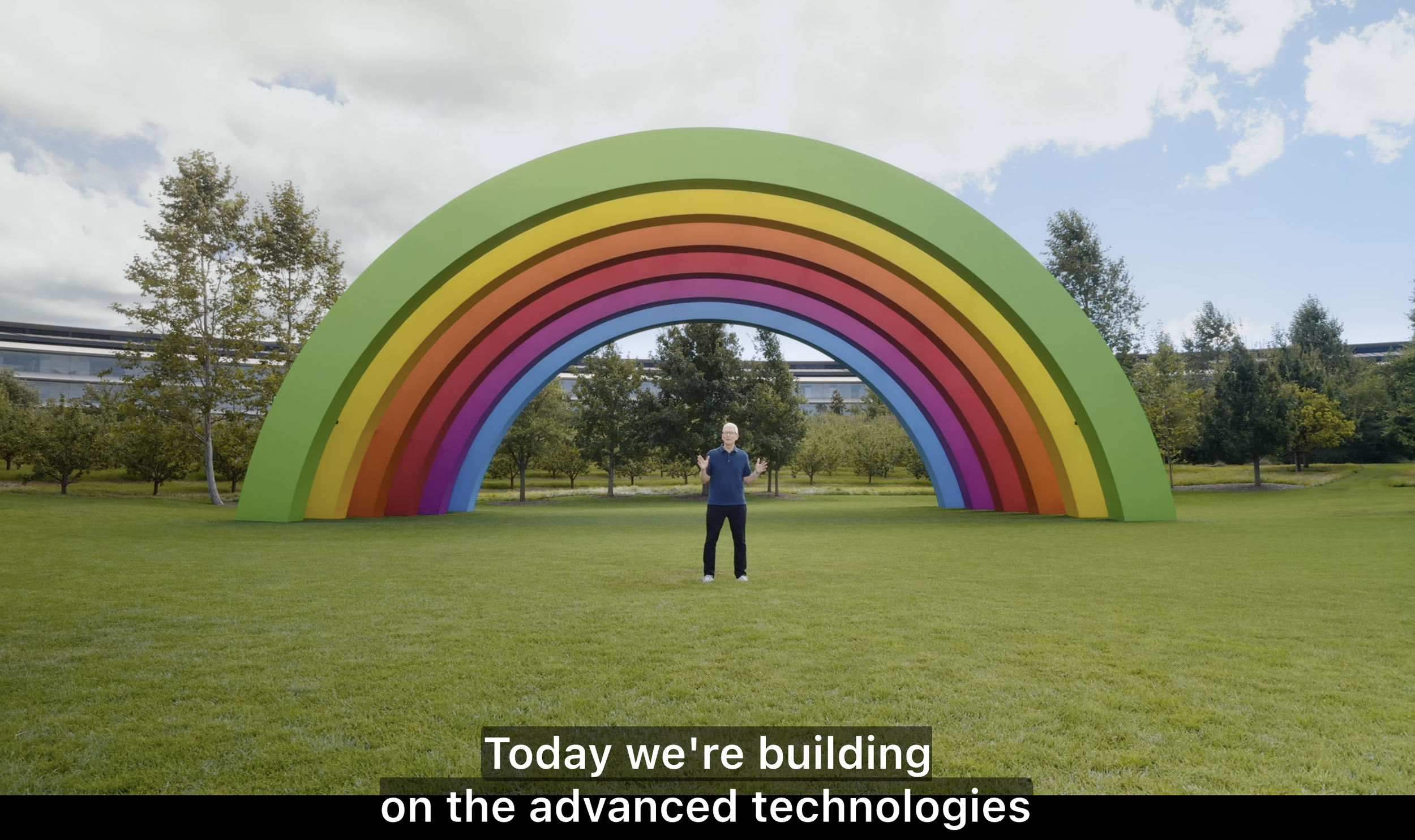
#Glowtime: A Masterclass in Design and Brand Playbook Execution
#Glowtime: Apple
No matter which side of smartphone the line you stand on, there is no denying the power that Apple wields in the tech industry. Even after launching the 16th generation of it's smartphone– the vast majority of its new features having been leaked and long-predicted by tech blogs and brand fanatics alike– you have to admire the brand and design machine that Apple is today. Love them or hate them, you can't ignore the Wonka–level factory of brand magic and pixeldust they carefully pour into their product launches these days. Let's explore the playbook behind these storied Apple product launches, and learn how the power between design and brand can yield a lasting connection that builds compounding value for your brand.
Breaking Down the Playbook
Setting the Date
Apple
There's a reason that Christmas comes at the end of the year, because nothing generates more excitement than the anticipation of what's to come. Similarly, Apple meticulously plans their launch dates to build up this very anticipation, knowing that timing is key to stoking desire and curiosity among their audience. By setting the stage well in advance, and employing a strategic blend of teasers, leaks, and subtle hints, they create a crescendo of excitement, akin to a symphony that builds to a climactic finale. This ensures that by the time the product is unveiled, both media and consumers are primed and ready. This carefully choreographed timeline not only maximizes attention and engagement but also amplifies the impact of the product reveal, turning it into a monumental event that captures the world's imagination. This orchestrated build-up ensures every detail and nuance of the launch is perceived as a significant moment in tech history, resonating far beyond the moment of unveiling.
Key takeaway: Don't catch your audience off-guard, let them know something great is coming, and work hard to make that launch magical, and memorable.
The Preamble
Apple
When your a brand that has to appeal to such a broad audience, like Apple, showing a compelling video that showcases a wide variety of users, doing a wide variety of activities demonstrates who the products are intended for. Right off the bat, we see who Apple intends to sell to – everybody. While nothing is harder for brands than being all things to all people– if you're going to climb that mountain, you better start by showing all the people in your communications. Sometimes Apple can be a little too on-the-nose with this, but we are far from the days when only supermodels were worthy of being shown in tech marketing. In the #Glowtime launch event, Apple continues to keep it fresh.
Key takeaway: Products deliver experiences, show your target audience what experience they can achieve with your product. They don't have to be overdramatic to be impactful, they just need to be authentic.
Historical Context = Momentum
Apple
All Apple launches historically start with an update on how their current products have performed. There is a nuance to this that I believe gets often overlooked. It bridges the value of their past products to what they are about to announce. Product launches are about generating excitement for what's new, but Apple masterfully positions the value of what they have already delivered in a way that doesn't devalue it's past. By using the past products as a launching point, they carry that value as momentum into what they are launching today. So many brands miss this nuance, and focus too much attention on reintroducing what they have already launched, and leaving audiences feeling like they aren't really getting anything new– because it's all a story they've heard already.
Key takeaway: By beginning with your product's historical performance, your brand can parlay into new features with momentum without having to repeat yourself.
Keep it Moving
Different speakers, backdrops, and locations keep the momentum rolling
The pandemic drove Apple toward virtual product launches over on-stage performances, and they never looked back, even post-pandemic. I would argue that they have never looked better ever since. The live-action on-stage formula was getting very tired as it was, and it further limited their ability to communicate with the dynamic vigor we see today. Seeing more faces, and more roles on the team is a refreshing update to the leadership-only model that plagues most silicon valley tech launches. It humanizes the company, and the audience doesn't feel like it's being talked down to by powerful tech executives trying desperately to recreate to the Steve Jobs of old. It brings the technology into direct user context.
“The live-action on-stage formula was getting very tired as it was…”
Making it easy to imagine yourself with their shiney new device, and they they quickly move to the next segment while you're still engaged. This is so much smoother than the awkward on-stage introductions and executive showmanship of past launches. Nothing loses an audience faster than a poor presenter talking about boring tech specs – I'm glad to see those days are behind us. Make sure your brand doesn't make the same mistake.
Key takeaway: Get to the point and move along. Keep your audience engaged by carrying energy and momentum from one segment (or slide) into another.
Dashboards ≠ Slides
Apple: Well-designed summary dashboards can replace dozens of slides
We've all seen them – the embarrassingly overloaded slides that plague the conference rooms and meeting culture of corporate America. Could anything turn your attention off faster than a static slide with gobs of words getting spoon-fed to you by the presenter? Apple understands this is problematic, and flips the script on this formula by replacing static figures, word-heavy descriptions and motionless backgrounds with dynamic backgrounds, team leaders who know the product inside and out, and beautiful graphical dashboards that build up as the presentation content is revealed. Leaving you with beautifully crafted graphical overview that keeps the audience's attention while the complexities of the advanced underlying technologies wash over them.
Key takeaway: Keep your visuals dynamic, utilize motion and video where possible, and when you have a lot of content to communicate– build into it and build toward a 'dashboard overview' that sums up what your presented.
X-Ray Vision
Apple: Showcase the whole design, inside and out
Designers can easily get tunnel vision when it comes to visualizing the exterior of a product, but nothing dispels the old notions that 'design is just a pretty wrapper' better than showcasing what's inside with the same pomp and circumstance that is used to highlight the product's sleek exterior. Apple's visual language approach emphasizes internal innovations just as much as the sleek appearance, highlighting intricate engineering feats and technological advancements with engaging animations and detailed visual breakdowns like layered x-ray, and exploded view animations. By doing this, they enhance the credibility and perceived value of the product, illustrating a marriage of design and engineering that captivates audiences and elevates the brand. This strategy not only educates consumers but also strengthens the brand's commitment to excellence in both design and engineering.
Key takeaway: Design doesn't end with exterior visuals, showcase your partnership with engineering by showing what is inside the product with the same level of visualization. Bonus: this will push you to consider the inside to be just as important as the outside - making design's reach naturally more holistic. Win-win!
Insights for Design and Brand Leaders
Design leaders need to start thinking like brand leaders, and brand leaders needs to start thinking like design leaders. It's not as another department's responsibility, both are equally responsible. How key information is communicated to your target audience is just as critical as the details of the product itself. Brand and design are forever locked in a symbiotic relationship that serve a singular purpose– to build trust with your end customer. Until the disparate silos of these critical business functions are truly integrated, it will be more than an uphill battle to match the design and communication quality that Apple has demonstrated for the last 15+ years.
“Love them or hate them, you can't ignore the Wonka–level factory of brand magic and pixeldust they carefully pour into their product launches these days.”
Build the Design-Brand Bridge in Your Own Workplace
Building a strong design-brand bridge in your workplace involves deliberate strategies and practices that align design outputs with brand values. Start by understanding your brand's core values and ensuring these are reflected in every design decision. Develop a cohesive design language system that serves as a visual and functional representation of your brand ethos. Encouraging cross-departmental collaboration can also foster alignment, as it brings diverse perspectives into the design process and ensures that all stakeholders are on the same page. Implementing feedback loops for continuous improvement allows for refining designs to better meet brand promises and consumer expectations. Additionally, investing in design education for your team can cultivate a deeper understanding of the brand and how best to represent it. By focusing on these strategies, you can create products and experiences that resonate with users, building trust and loyalty while driving your brand narrative forward.
––
Jayson Simeon
Adaptitude | Principal and Founder
Adaptitude is a design services company that exists to transform product and service companies into powerhouse brands. We design products, teams, and capabilities that deliver brand-focused solutions.


